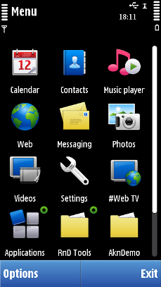
Scrollbars
With any list, grid or other component that can be scrolled vertically, a scrollbar appears on the right-hand side of the component. The scrollbar is displayed also on pop-up components.
The placement of the scroll handle on the scrollbar reflects the position of the focus on the scrolling content.
The size of the scroll handle reflects the number of displayed items relative to the total number of items on the scrolled component.
The scrollbar can be displayed in the same view without scrolling. When this is the case, the scroll handle is displayed at the maximum size. The only exception is the Application Shell, where scrollbar is not displayed if all items fit the same view.
Scrollbars in Touch UI
In touch devices based on the Symbian platform, scrollbars (vertical and horizontal) have a touch-enabled scroll box. The hardware keys (Arrow keys) can also be used for scrolling when the scrollbars are visible.
For the scrollbar to be more usable with touch, the actual scrollbar area is wider than the visible scrollbar. When the user scrolls, the scrollbar has a related effect to indicate the scrolling. Because the actual area of scrollbar is wider, the items appearing on that area in scrollable list, grids, viewers cannot be touch-enabled, for example,list icons in column D cannot be tapped.
User action |
State change |
Feedback |
|---|---|---|
Touch down on a scrollbar, no thumb |
Scrolling is activated when there is a scrollbar under the touch event. Scrollbar thumb is moved towards the touch down position on the scroll bar. Scrolling is done for a page at a time. |
Scrollbar color is changed to indicate that the scrollbar has the control. Tactile:
|
Touch down on a scrollbar thumb |
Scrollbar thumb can be moved in desired direction. Scrollbar thumb color is changed as an indication to the users that scrolling can be performed. |
Scrollbar thumb color is changed to indicate scrolling activation. Tactile: Sensitive slider effect and audio feedback provided with touch down and release events. |
Touch down and hold scrollbar, no thumb |
This action performs a “key repeat”. The scrollbar thumb is moved towards the touch down position |
Tactile: Sensitive slider effect and audio feedback provided with touch down and with steps. |
Touch down and move |
Scrollbar thumb is moved along with the touch event. Touch down on scrollbar thumb, dragging and touch release are performed on the scrollbar control area. |
Tactile:
|
Touch down on scrollbar thumb and move outside the scrollbar control area |
Scrollbar thumb remains in the position where it was when the finger left the scrollbar control area. If the user moves the touch outside the scrollbar control area and back, the thumb will continue to move along with the touch event. After touch down on scrollbar thumb, touch is dragged out from the scrollbar control area, without releasing the touch. |
Tactile: Sensitive slider effect and audio feedback provided with touch down. No feedback is provided if the thumb is not moving. If the thumb moves, smooth slide feedback provided. Note: If touch release happens
outside the scrollbar, no feedback is provided.
|
Using scrollbars in applications
The API to use for creating the scrollbar component is the Scroller API.
To use a scrollbar in your application, first create a scrollbar frame using theCEikScrollbarFrame class. All scrollbar operations are executed via this scrollbar frame. These operations include creating and destroying the scrollbar, setting its visibility, and adjusting the scrollbar's model. The scrollbar itself can be created using the CEikScrollBarFrame::CreateDoubleSpanScrollBarsL() method. The class for the scrollbar is CAknDoubleSpanScrollBar. For implementation information, see Creating a scrollbar.
Scrollbar models encapsulate the range of integers which a scrollbar can represent, from zero to n, and the current position of the scrollbar thumb within that range. To set the scrollbar model, use the TAknDoubleSpanScrollbarModel class. For information on updating the scrollbar's position and size using the scrollbar model, see Updating ArrowHead scrollbar attributes and Updating DoubleSpan scrollbar attributes.
You can control the scrollbar visibility using the CEikScrollbarFrame::SetScrollbarVisibilityL() method.
To observe scrollbar events, use the MEikScrollbarObserver class. For implementation information, see Observing scrollbar events.
Copyright ©2010 Nokia Corporation and/or its subsidiary(-ies).
All rights
reserved. Unless otherwise stated, these materials are provided under the terms of the Eclipse Public License
v1.0.