Selection list
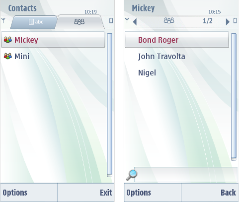
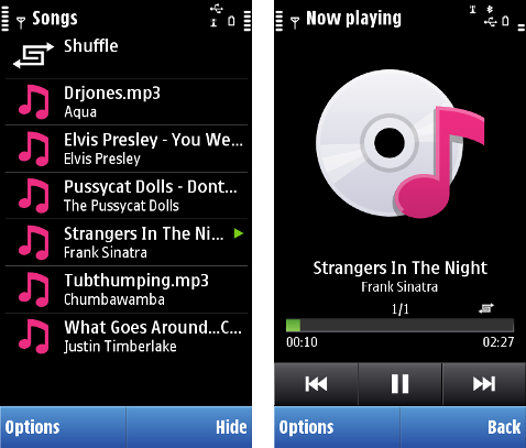
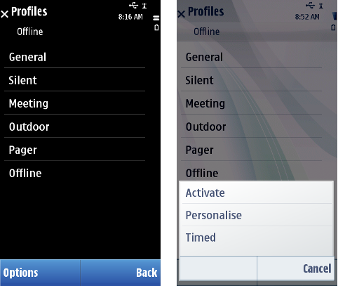
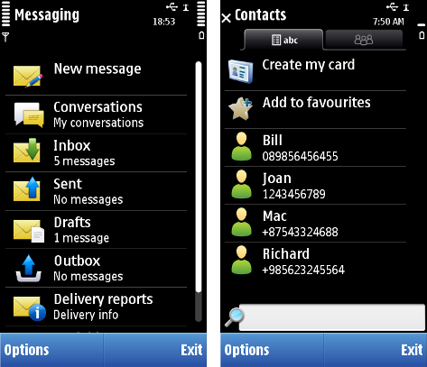
A selection list is a common means of displaying and accessing data in applications. When a selection list is displayed, the application is typically in a permanent state, which means that the user can leave the application, open another application, and later return to the same state. Selection lists are displayed in the main pane.
Typically, the user can open items in a selection list, leading into another, more detailed view of the item within the application. In addition to browsing and selecting items, other functions are available in the Options menu (see Options menu ).
The usage of the Selection key in selection lists deserves special attention. Depending on the case, it can do the following actions:
-
Selects the item in focus. This should happen whenever it is assumed that it is clear to the user what happens. Selecting can mean:
-
Opening an item, such as a folder or a date in Calendar, leading to a detailed view.
-
Executing a command when the focused item is a command.
-
-
Opens the context sensitive Options menu. This should only happen when the user cannot be assumed to know what happens if the Selection key is pressed. The menu should contain only high-priority options associated with the item in focus, not general items such as Settings, Help, or Exit. The maximum amount of options in the context sensitive Options menu is four.
The two types of Selection key actions should not be mixed within one list; one or the other should happen for every item in the list.
The keypad functions for selection lists are as follows:
|
Key events |
Description |
|---|---|
|
Arrow up / Arrow down |
Moves up or down to next visible item in a list. |
|
Arrow left / Arrow right |
May be ignored, or may have navigation functions associated with them (see Navigation ). |
|
Selection key |
Selects the item; see the discussion above. |
|
Left softkey (Options) |
Opens the Options menu (see Options menu ). |
|
Right softkey (Back; Exit) |
Back stepping (see Navigation ). |
|
Clear |
Deletes the item if it can be deleted (confirmation from the user is required); otherwise ignored. |
|
Edit |
Ignored, or a marking function if the list is markable (see Markable list ). |
|
Numeric keypad |
May be ignored, or may have specific functions within the state. |
|
Other keys |
Do the default action of the key. |
The following table lists the default touch events for selection list:
|
User action |
State change |
Feedback |
|---|---|---|
|
Touch down |
No effect |
Highlight is shown. Tactile: Basic list effect and audio feedback is provided with touch down event. |
|
Touch release |
Item is activated. |
Highlight disappears. Tactile: Basic list effect is provided with touch release event. |
|
Touch down and hold |
Stylus pop-up menu is opened. |
Highlight is shown. Animation is shown to indicate the opening pop-up. Tactile: If activates a long touch, then increasing long touch effect is provided with hold event. Pop-up effect is provided when the pop-up is opened. |
|
Touch event combinations, refer to Dragging and flicking events. |
Refer to Dragging and flicking events. |
Tactile: Refer to Dragging and flicking events. |
Using selection lists in applications
The API to use for selection lists is the Lists API . For implementation information, see Using the Lists API .
Copyright ©2010 Nokia Corporation and/or its subsidiary(-ies).
All rights
reserved. Unless otherwise stated, these materials are provided under the terms of the Eclipse Public License
v1.0.


