Navi pane
The principal uses of the Navi pane are to display information about the current state and view, and to help the user to navigate in the application.
Depending on the context, the Navi pane contains elements presented in the following table.
| Component | Description |
|---|---|
|
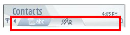
Tabs |
Tabs are used to view parallel data views alternatively. Arrow indicators
are shown at both ends of the pane when there are further tabs to scroll in
the corresponding direction. Each tab has either a graphic or a text (or both)
as a label. The following tab layouts can be used:
More than four tabs can exist simultaneously. They can be scrolled horizontally. However, as a design guideline, the number of tabs should be kept small (the maximum of six tabs is recommended), and the number should not be dynamic. See GUID-72DE3EB1-1AF5-4157-8B99-A1C7143DAD2C.html for a description of the effect of tabs on the navigation within an application. |
|
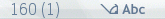
Navigation text (icon+text) |
Navigation text is displayed in the Navi pane when similar items can be browsed by scrolling horizontally, such as dates in Calendar. Arrow indicators at both ends of the pane indicate the possibility to scroll. |
|
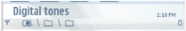
Indicators |
In editors, the Navi pane contains editing indicators. See Indicators for a more detailed description of the Navi pane indicators. |
|
Folder structure indication |
Opened subfolders are indicated in the Navi pane . |
|
Application-specific content |
When none of the above content types is suitable, the Navi pane content can be designed specifically for an application. |
|
Empty pane |
The Navi pane can be empty. |
Using the navi pane in C++ applications
The API to use for the Navi pane is the Navigation pane API . If you use tabs in the Navi pane, the API for controlling the tabs is the Tabs API .
For the indicators in the Navi pane, use the Indicators API .
For implementation information on the Navi pane, see Using the Navigation pane API . For implementation information on tabs, see Using the Tabs API .
The class MAknNaviDecoratorObserver provides touch support for the tab arrows in the Navi pane. To set the observer, use the method CAknNavigationDecorator::SetNaviDecoratorObserver() .
To create a tab group in the Navi pane, use the method CreateTabGroupL() in the class CAknNavigationControlContainer . This is a factory method for a pre-implemented navigation pane tab group control.
Copyright ©2010 Nokia Corporation and/or its subsidiary(-ies).
All rights
reserved. Unless otherwise stated, these materials are provided under the terms of the Eclipse Public License
v1.0.