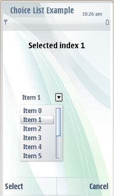
Choice list
Choice list is a list type, which allows selection from different choices. Choice list can either be closed (by default) state or opened state. In case the choice list is empty, the opening button is dimmed and is inactive.
Choice list displays currently selected value by default in closed state. When the choice list is opened, choice list pop-up displays the list of available options (with currently selected focused). Choice list can contain text, icons or combination of both text and icons. It is recommendation use only text in the choice list.
It is possible to dynamically add and remove items in choice list. The user can browse through the list with scroll keys or with the touch event.
|
Key |
Action |
|---|---|
|
Enter |
Selects the focused item and closes the choice list. |
|
Left selection key ( Select ) |
Choice list item is selected. |
|
Right selection key ( Close ) |
Choice list is closed without making a new selection. |
|
Arrow left / right keys |
Closes the choice list, with focused item selected. |
|
Arrow up / down keys |
Scrolls through the choice list. Choice list is looping. |
|
User action |
State change |
Feedback |
|---|---|---|
|
Touch down |
Inactive, tooltip is shown. |
Tactile:
|
|
Touch release |
Opens the choice list pop-up |
Tactile: Pop-up open effect is given. If pop-up owns NGA effect and they are ON, then increasing long touch effect is provided with touch release. |
|
Touch release |
Inactive |
|
|
Touch down and move out of the list |
List continues its movement. |
Basic tactile feedback is provided with touch down event. Refer to Dragging and flicking events. |
|
User action |
State change |
Feedback |
|---|---|---|
|
Touch down and release |
Touch down moves the focus. |
Pressed down highlight.
Tactile:
|
|
Touch release |
Selects the focused item and closes the choice list. |
Tactile: Basic list effect is provided with touch release event. |
|
Touch down and move inside the choice list. |
The whole list moves along with the finger. Refer to Dragging and flicking events |
Tactile: Basic tactile feedback is provided with touch down event. Refer to Dragging and flicking events. |
|
Touch down and move out of the choice list |
The list continues its movement according to the finger movements outside the pop-up. |
Tactile: Basic tactile feedback is provided with touch down event. Refer to Dragging and flicking events. |
|
Touch down and release outside the opened choice list. |
Inactive |
Basic tactile feedback given with touch down event. No advanced tactile feedback. |
Using choice list in applications
The API to use for choice list is the Choice list API . For implementation information, see Providing a vertical list of selectable items .
Copyright ©2010 Nokia Corporation and/or its subsidiary(-ies).
All rights
reserved. Unless otherwise stated, these materials are provided under the terms of the Eclipse Public License
v1.0.
