Generic button API
The Generic button API is used for enabling touch support for buttons.
An Avkon button is a generic button component specifically designed for touch support. The generic button component ( CAknButton , defined in aknbutton.h ) is used, for example, in a toolbar and a status pane. The button can contain text, an image, or both.
Buttons can have multiple states, and each of the states can have three different states according to user actions. The possible user-action states for the button states are:
-
Normal
-
Pressed down
-
Dimmed
By default, the button has a frame, it responds to tap (press) event, has a latchable view in the pressed-down state, and has horizontally and vertically aligned text in it. Some default behavior can be changed with button flags or with the help of member functions.
To observe the buttons in your application, use the MCoeControlObserver observer interface.
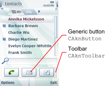
The Generic button API is used for creating buttons that are displayed as parts of container components, such as a toolbar. It is not used for creating CBA buttons displayed in the control pane at the bottom of the device screen. The API for creating CBA buttons is the Buttons API .
For look and feel guidelines on the generic button component as part of a toolbar, see the toolbar UI component description .
For information on using the API, see Enabling touch support for buttons .
For the Generic button API classes and header files, see Classes and Definitions.
Copyright ©2010 Nokia Corporation and/or its subsidiary(-ies).
All rights
reserved. Unless otherwise stated, these materials are provided under the terms of the Eclipse Public License
v1.0.