Toolbar API
The Toolbar API is used for enabling quick access to functions by displaying them in a toolbar.
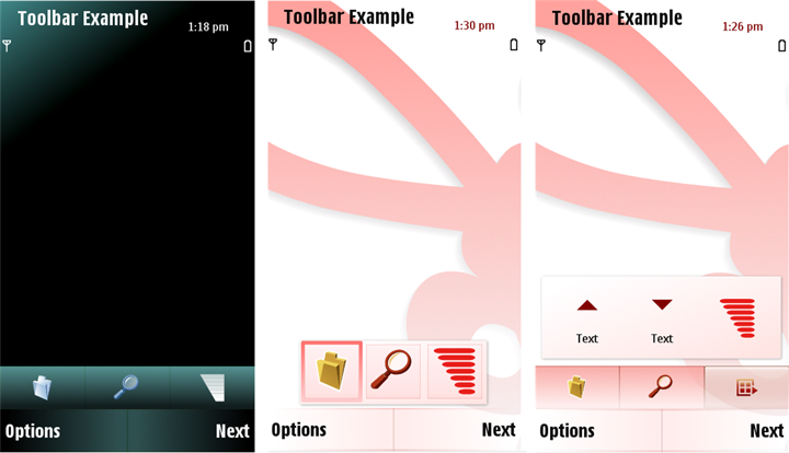
A toolbar contains AVKON buttons. The toolbar supports touch, and can be with focus or without focus. It contains application-specific buttons (at least three) that launch application-specific commands. The toolbar content is application-specific, but you can choose whether the toolbar is displayed in an application view or not.
The Toolbar API supports two types of toolbars: a fixed toolbar for touch UI, and a floating toolbar which can also be used in non-touch UIs.
The fixed toolbar doesn’t have focus, whereas the floating toolbar owns the focus and it can be used also with navigation and selection keys. By default, the floating toolbar owns the CBA buttons ( Select and Close ) but the floating toolbar can be defined as not having the CBA buttons with suitable flags.
The toolbars are also located differently: a fixed toolbar has a permanent place in the layout but a floating toolbar can be freely located when it is defined as having a flexible position.
The toolbar extension is a toolbar button that expands the fixed or floating toolbar. When the extension button is pressed, a grid of toolbar items opens up. The extension items can be used as actual toolbar items.
The extension button itself looks like an ordinary toolbar button. The only difference is that there is a default icon for the extension button that is shown if the application does not change the icon itself.
For user experience guidelines on the toolbar component, please see the toolbar UI component description .
For information on using the API, see Enabling quick access to functions with a toolbar .
For the Toolbar API classes and header files, see Classes and Definitions.
Copyright ©2010 Nokia Corporation and/or its subsidiary(-ies).
All rights
reserved. Unless otherwise stated, these materials are provided under the terms of the Eclipse Public License
v1.0.
