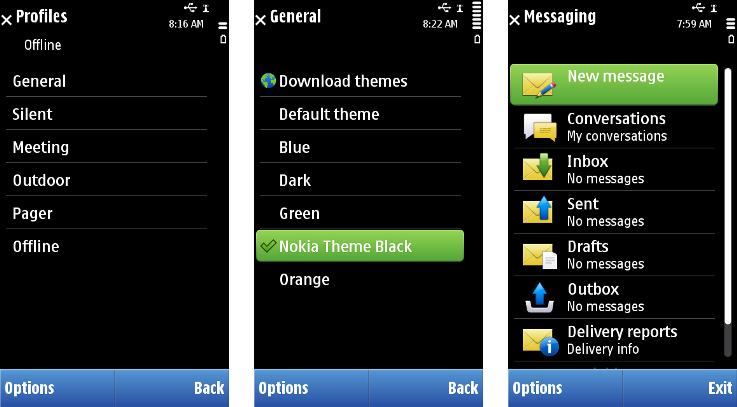
Column structure of lists
For visual consistency, the standard list layouts are built around a structure of three virtual columns. The column borders are aligned with the sides of the context pane.
The width of list items can be divided in three sections (columns A, B and C). All three columns need not be used separately in a list layout: combinations AB, BC or ABC are possible. Column D is basically the very end of column C where additional indicators can be displayed (see figure below). The area for these indicators is not strictly an individual column in the same sense as the other three, because it can be used dynamically, item by item. All items within a list must use the same column layout.

| Column | Description |
|---|---|
|
Column A |
|
|
Column B |
Heading (the title or attribute of the item). |
|
Column AB |
|
|
Column C/BC/ABC |
The main text of the item. |
The list layout can be mirrored for localizations such as Arabic and Hebrew (for example, column A is in the right edge of the pane). See Layout changes in bi-directional languages .
Copyright ©2010 Nokia Corporation and/or its subsidiary(-ies).
All rights
reserved. Unless otherwise stated, these materials are provided under the terms of the Eclipse Public License
v1.0.