Order of items and browsing in grids
In a grid, the available items are in a rectangular arrangement of cells and browsing is possible in four directions. In addition to the up and down functions, the user can press the Arrow right key to move the focus one step to the right, or the Arrow left key to move the focus one step to the left.
The number of items can be larger than what fits in the view, so the grid items may scroll in the view when browsing.
-
The preferred scrolling dimension is vertical; this means that when more items are added, the number of items in a grid grows downwards line by line, but not outside the window to the left or right.
-
A grid should not be scrollable in both dimensions; it is acceptable only in cases where the grid has a natural geometry that cannot be changed. Calendar's Month view is an example of this kind of geometry (but even in that case it is better to fit the whole month on the screen rather than make it scrollable in both dimensions).
-
The default filling order of choice items in a grid is first left to right, then top-to-bottom. In right-to-left languages, the order is flipped horizontally.
In certain cases, it is possible that a grid is not filled completely. Depending on the application, the grid can be auto-filling (for example, the cells are moved within the grid so that empty cells in the middle get filled), in which case there can only be empty cells on the rightmost part of the last line. Other applications may allow empty cells anywhere, so that the grid can be sparse.
Browsing in grids that scroll vertically resembles traditional scrolling in text editors, based on the idea that the user can always move to the correct row first and then move within the row to the correct item. The following rules are applied:
-
Empty cells are skipped: the focus is never on an empty cell.
Note: An exception to this occurs when the user is moving items around in a grid; in that case, all cells are accessible.
-
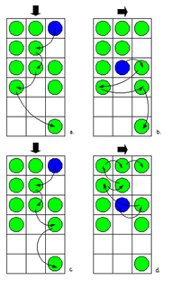
When browsing up or down, the focus is moved to the adjacent cell directly below or above the current cell if that cell is filled. In case it is empty, the nearest cell towards the beginning of the same row gets the focus. If all cells on the row are empty, the search continues on the next row in the same direction, and so on, until a filled cell is found.
-
When browsing towards the end of a row, the focus moves to the following filled cell on the same row. If there are no filled cells in that direction on the row, the search continues from the beginning of the next row, and so on, until a filled cell is found.
-
Browsing towards the beginning of a row moves the focus to the previous filled cell on the same row, or continues searching from the end of the previous row. Using only the Arrow right or Arrow left key, the user can thus go through every item in the grid, regardless of the distribution of items in it.
Note: In right-to-left UI languages, such as Arabic and Hebrew, the end of a row is on the left-hand side. Respectively, the beginning of the line is on the right.
-
The grid is scrolled (moved within the view) only when the item that is becoming focused is not fully visible already.
-
A grid may also loop vertically within the same column. When browsing down from the cell at the bottom of a column, the focus moves to the choice item at the top of the next column and vice versa. If the focus is in the last column when applying the previous rule, the focus loops over to the top of the first column and vice versa.
Copyright ©2010 Nokia Corporation and/or its subsidiary(-ies).
All rights
reserved. Unless otherwise stated, these materials are provided under the terms of the Eclipse Public License
v1.0.