Usability considerations
All touch and gestural interfaces have to appear competent and safe. The interface must appear such that it is not going to misuse users' personal data or break down. Optimizing system performance is critical here. Low screen refresh rate and latent images do not give the impression of a trustworthy touch UI. The use of touch screen and sensors may also increase battery consumption of mobile devices.
Touch screens consume most power during touch operations, and reducing unnecessary user interaction can help increase power efficiency. Specifically with resistive touch screens, avoiding excessively long touch and drag user actions is recommended. The continuous touch event flow keeps the CPU busy. The screen lock turns off the touch completely. To learn more about both optimizing system performance and battery life, see the Power Management section at the Symbian Foundation.
The best products predict the needs of their users and then fulfill those needs in unexpectedly pleasing ways. Adaptive targets are one way to do this. Controls that match the users actions well are another way devices can be clever.
Interaction design
Use appropriate and simple interaction logic:
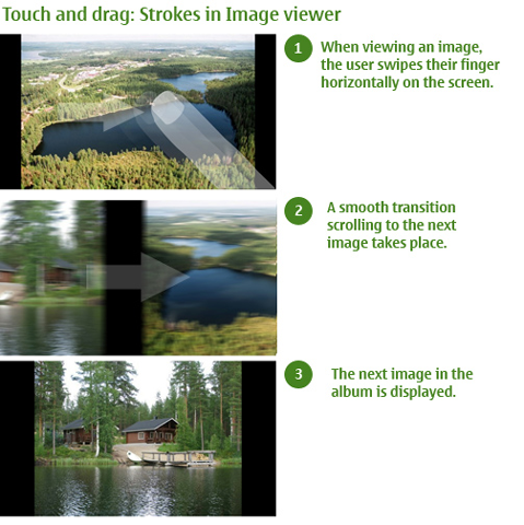
Navigation and controls must be clear and meaningful to prevent mistakes: strokes along the touch panel must produce a logical outcome.
The coolest interaction in the world is empty unless it has clear meaning for the person performing it. When using indirect controls, the UI response must relate to the action the user is performing.
Meaningful controls are easier to learn and remember.
Touch UI can employ direct or indirect controls, or a combination of both:
Direct controls allow users to simply tap the item they want to manipulate right on the screen itself, move it, make it bigger, scroll it, and so on. For more information, see UI components and Touch support for common UI components.
Indirect controls use some other means to manipulate an object, for example, shaking, tilting, flipping, waving and so on. For more information, see Sensor interaction.
Although Symbian platform allows the use of scrollbars, it is common to reverse the page scrolling orientation in applications such as browser. In absence of scrollbars, users will flick or drag the page upwards rather than pull a scrollbar down to move the page up, that is, to scroll down. In this case, scrollbars are used as navigation indicators.
Direct taps and strokes are far easier for the user to understand and pick up than abstract, indirect ones. A single view must always employ only a few indirect strokes, so that the controls do not confuse the user.
Visual design
See also:
Copyright ©2010 Nokia Corporation and/or its subsidiary(-ies).
All rights
reserved. Unless otherwise stated, these materials are provided under the terms of the Eclipse Public License
v1.0.
