Touch support for UI components
Component |
Example image |
Touch support |
|---|---|---|
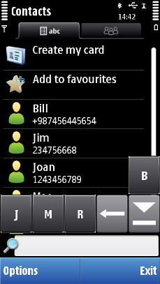
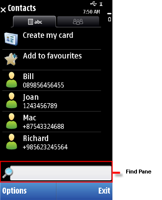
Single tap on the find pane activates this item. |
||
Single tap activates this item. |
||
Single tap activates this item. |
||
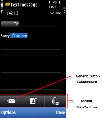
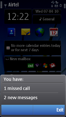
Touch down keeps the pop-up visible. Touch release either dismisses the pop-up or activates the application-specific functionality. Most commonly, it activates the application. |
||
Long tap activates the item. |
||
A short tap activates the item (emulates a selection key press). |
||
A short tap activates the item. |
||
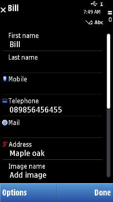
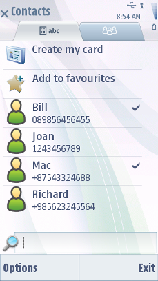
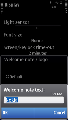
In the view state (a normal two-row list item), a short tap activates it (emulates a selection key press). In the edit state, a short tap launches a touch input window. Within a item, the functionality is as for a text field. |
||
|
Same as for equivalent setting items |
|
A short tap activates the item (emulates a selection key press). |
||
Left/Right arrows in the Navi pane |
A short tap activates the item and navigates between the views. |
|
A short tap activates the item (emulates a selection key press). |
||
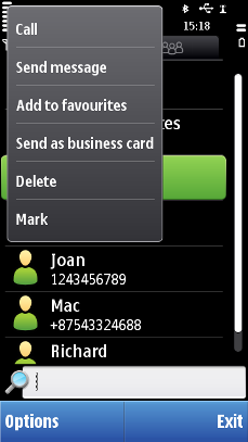
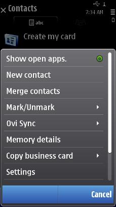
Menu list (for example,Options menu and submenus) |
A short tap activates the item (emulates a selection key press). |
|
A short tap marks/unmarks the item. |
||
Setting items |
||
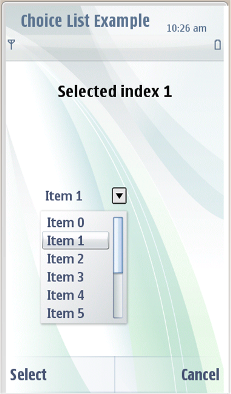
Pop-up setting |
A short tap activates the item (emulates a selection key press). |
|
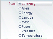
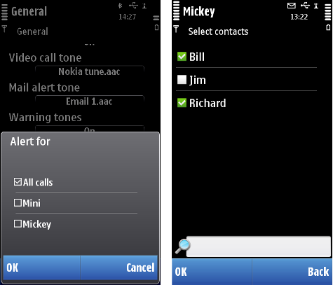
Multi-selection list setting |
A short tap activates the item. |
|
The cursor can be moved with the text field. Dragging selects a block of text. |
||
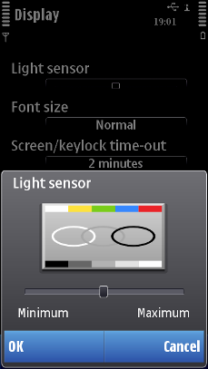
The slider thumb is draggable. |
||
A short tap activates the item(emulates a selection key press). |
||
Softkeys (left and right) in the Control pane Note: There is no middle softkey label in Touch UI
|
||
A short tap activates the functionality if the sub-pane has one (the signal and battery panes are inactive). |
||
Draggable slider thumb. Icons can be set as tappable. Volume slider thumb is draggable, and muting can be done directly by tapping the speaker icon. |
||
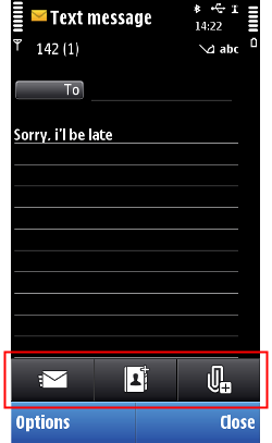
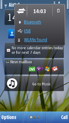
Tapping the link performs the application-specific functionality. Most commonly, opens the application. Tapping the description text without the link functionality is inactive. |


Copyright ©2010 Nokia Corporation and/or its subsidiary(-ies).
All rights
reserved. Unless otherwise stated, these materials are provided under the terms of the Eclipse Public License
v1.0.