Markable list
A markable list is a selection list with the added marking feature. The user can mark any number of items on the list while browsing it, and then execute a single command, which is applied to all the marked items. This is analogous to the multiple-item highlight feature used in computer GUIs.
The marking feature is typically applied to lists the user manages, containing a large number of items that may be for example sent, moved, or deleted. By marking items first and then selecting a command, the user can perform certain operations more quickly and with less key presses than by performing the command separately for each of the items.
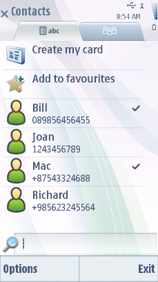
Marked items are indicated graphically.
The Mark and Unmark functions are available in the Options menu of the markable list. Alternatively, or as a shortcut, the user can keep the Hash (#) key pressed while using the Arrow keys and the Selection key in the following way:
Pressing the Hash (#) key marks the current item. This is a toggling function, so pressing the Hash (#) key on a marked item unmarks the item.
Pressing an Arrow key (up or down) while holding down the Hash (#) key marks both the current item and the one onto which the focus moves. If the user keeps holding the Hash (#) key and scrolls further in the same direction, all the scrolled items become marked; to unmark the items in reverse order the user can scroll into the opposite direction while holding the Hash (#) key down.
Items can be unmarked by pressing the Hash (#) key together with scrolling: if the user starts holding the Hash (#) key down when on a marked item and then scrolls, all the scrolled items become unmarked.
Several marking actions can be done subsequently. The user can mark an item, then release the Hash (#) key, browse and move the focus onto some other item on the list, and then mark that item. The first item remains marked, and the ones between the two do not become marked.
All items become unmarked when the user exits the list, for example by back stepping. There may be exceptions to this rule in certain applications that require selecting items from several levels of folder hierarchy. An example of this is creating a play list in the Media Player application. Items remain marked if the user opens and cancels the Options menu, or swaps applications.
Pressing the Selection key when there are marked items on the list opens the context sensitive Options menu containing only those functions that apply to multiple items.
A markable list functions exactly like a normal selection list, except for the marking feature.
Devices that have the optional Edit key perform these same functions by using the Edit key and arrow keys instead of the Hash (#) key.
The user may access the Options menu to perform functions on all marked items at once. When user has one or more items marked, Options menu does not contain items that apply to one item only (such as Open). Exceptions are Help and Exit, which should appear in every Options menu. Appropriate error handling must be designed for functions that do not apply to some or all of the marked items.
When executing a function, if any of the items are marked, all the marked items are affected by the function. If the focus is on an item that is not marked, the function does not affect that item.
After the selected function is successfully done, all items are unmarked. In an error case, when the function cannot be applied, the marks should remain in place.
The Options menu includes the marking and unmarking functions in a submenu so that any user can find the feature. The submenu has also the Mark all and Unmark all options.
For other keypad actions, see Selection list.
User action |
State change |
Feedback |
|---|---|---|
Touch down |
The marked/unmarked status of all items remains unchanged. |
Highlight is shown. Tactile: Basic list effect and audio feedback is provided with touch down. |
Touch release, while no item is marked |
Activates the item |
Highlight disappears. Tactile: Basic list effect is provided with touch release event. |
Touch down and hold, while no item is marked |
Stylus pop-up menu is opened with an option Mark §QTN_OPTIONS_LIST_MARK_ONE§. If user selects Mark, the pop-up is closed, highlight removed and the item becomes marked. |
Highlight is shown. Animation is shown to indicate the opening pop-up. Tactile: If activates a long touch, then increasing long touch effect is provided with hold event and pop-up effect is provided when the pop-up is opened. |
Touch release, while at least one item is marked |
A context specific options menu opens. The marked/unmarked status of all items remains unchanged. Context specific options menu should contain items for Mark/Unmark and any needed items that apply to all marked items. |
Highlight disappears. Tactile: Pop-up open effect is provided. If pop-up has theme effects and they are ON, then increasing long touch effect is provided with touch release. |
Touch down and hold, while at least one item is marked |
Inactive |
Tactile: No effect |
User action |
State change |
Feedback |
|---|---|---|
Control and touch down |
Mark/unmark the item touched. Toggle between marked and unmarked. |
Highlight is shown. Tactile: Basic list effect and audio feedback is provided with touch down. |
Control and touch release |
No effect |
Highlight disappears. Tactile: No effect. |
Shift and touch down |
If there is highlight brought by the hardware key event, mark/unmark all items between focused and touched down item. If the item touched down is unmarked, then all items between the item and focused item are marked, and vice versa. |
Highlight is shown. Tactile: Basic list effect and audio feedback is provided with touch down. |
Control/Shift and touch down and hold |
Inactive |
Tactile: No effect |
Using markable lists in applications
The API to use for markable lists is the Lists API. For implementation information, see Using the Lists API.
Copyright ©2010 Nokia Corporation and/or its subsidiary(-ies).
All rights
reserved. Unless otherwise stated, these materials are provided under the terms of the Eclipse Public License
v1.0.