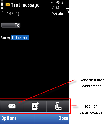
Generic button
Button is a generic component, which may have touch down and release and/or touch down and hold functionality. Touch down and hold can be interpreted as touch down and hold or key repeat. Generic buttons can be placed, for example, inside the toolbar.
The generic button can have properties such as ON/OFF button, Mode toggle button and Command button. For more details, see Toolbar :
-
Unavailable / dimmed when button function is not available
-
Available and not pressed with or without focus when the button is active but has not been pressed
-
Latched down with or without focus , for example, in case where there are many different text formatting options ON at the same time. In multiple mode buttons, user can switch between the different ’selected’ modes by touching the multiple mode button again. States change after touch release and current mode’s function is executed. Button states loop when the user touches those again
-
Pressed with or without focus - This state indicates to the user that touch down has activated the button
|
User action |
State change |
Feedback |
|---|---|---|
|
Touch down |
Button pressed effect. On down event application specific functionality. |
Graphical indication and possible tooltip Tactile: Basic button effect and audio feedback is provided with touch down. |
|
Touch release |
Activates the button, launches another view or event. Button is latched down or set to available and non-pressed. |
Switches between down look and non-pressed look of the button. When the toolbar button launches another view or event, the button does not appear latched down. Tactile: Basic button effect is provided with touch release. No audio feedback is provided. |
|
Touch down on a multiple mode button. |
Button is pressed. |
Tactile: Basic button effect and audio feedback is provided with touch down. |
|
Touch release on a multiple mode button. |
Current mode’s function is executed. User can switch between different modes by touching the multiple mode button again. State changes after touch release and current mode’s functions are executed. Button states loop when the user touches those again. |
Tactile: Basic button effect given with touch release. No audio feedback given. |
|
Touch down and hold (also known as long tap). |
Activates the button functionality, assigned for the touch down and hold event. Application specific. |
Tactile: Basic button effect and audio feedback is provided with touch down event. |
|
Touch down and hold (also known as key repeat). |
May or may not have key repeat functionality Application specific. |
Tactile: Basic button effect is provide with touch down. In case of key repeat, sensitive button effect is provided. |
|
Touch down and move out from the button and releasing. |
If the drag moves outside the container, button functionality is canceled with release event. |
Tactile: Basic button effect and audio feedback with touch down is provided. No feedback with release. |
|
Touch down and move out from the button and then back before up event. |
As in touch down and release. |
Tactile: Basic button effect and audio feedback is provided with touch down. If release activates a function, then basic button effect is also provided with touch release. No audio feedback with touch release. |
|
Touch down and move out from a button to another button and then releasing. |
If the drag goes outside the container, button functionality is canceled with release event and does not activate the another button. |
Tactile: Basic button effect and audio feedback with touch down. No feedback with release. |
Using generic buttons in applications
The API to use for creating the generic button component is the Generic Button API .Copyright ©2010 Nokia Corporation and/or its subsidiary(-ies).
All rights
reserved. Unless otherwise stated, these materials are provided under the terms of the Eclipse Public License
v1.0.